My redesign dropped it from 25% → 5%, reducing Operational Risk by 80%
In the final testing, users can complete compliance-sensitive orders independently rather than relying on support tickets (manual intervention).
Identifying the problems
I interviewed 4 internal employees and narrowed down to three pain points:
Missed Critical Decisions
"There are so many hidden options in this form that are crucial for a truly customizable order. Customers don't know about these details."
Disorganized Order Path
"You have to keep going back and forth pages and buttons to see what all the options are."
Unclear Descriptions, Status, and Results
“I don’t even know if anything I’m doing is correct, so I'm worried the result is not going to be what I want.”
Final validation
Comparing the User Flows visually demonstrate the reduced cognitive overload.
I tested my final designs with 10 real customers of 3Play Media. Participants claimed that there is a
noticable decrease in switching between pages and needing support.
Balancing Business and User Needs
Leadership Skills
As the Lead Designer for this project, I learned the importance of considering all proposals while also making firm decisions that are in the design's best interest. My team of 5 consisted of students from both engineering and design backgrounds, and our stakeholders were 3Play's Product Manager and Product Marketer, both whom don't specialize in design. I challenged design decisions while also advocating for everyone's perspective.
Skills I Gained from this Experience
Before this project, I was solely user needs-driven. I advocated strongly for the most seamless experience for users, but I failed to consider business needs. My disagreement with my mentor in this project taught me the value and strategy of solving for both business and user needs.
Original Form Average Task Time:
9 minutes
Original Form
Redesigned form Average Task Time:
6 minutes
Redesigned Form
-3 min
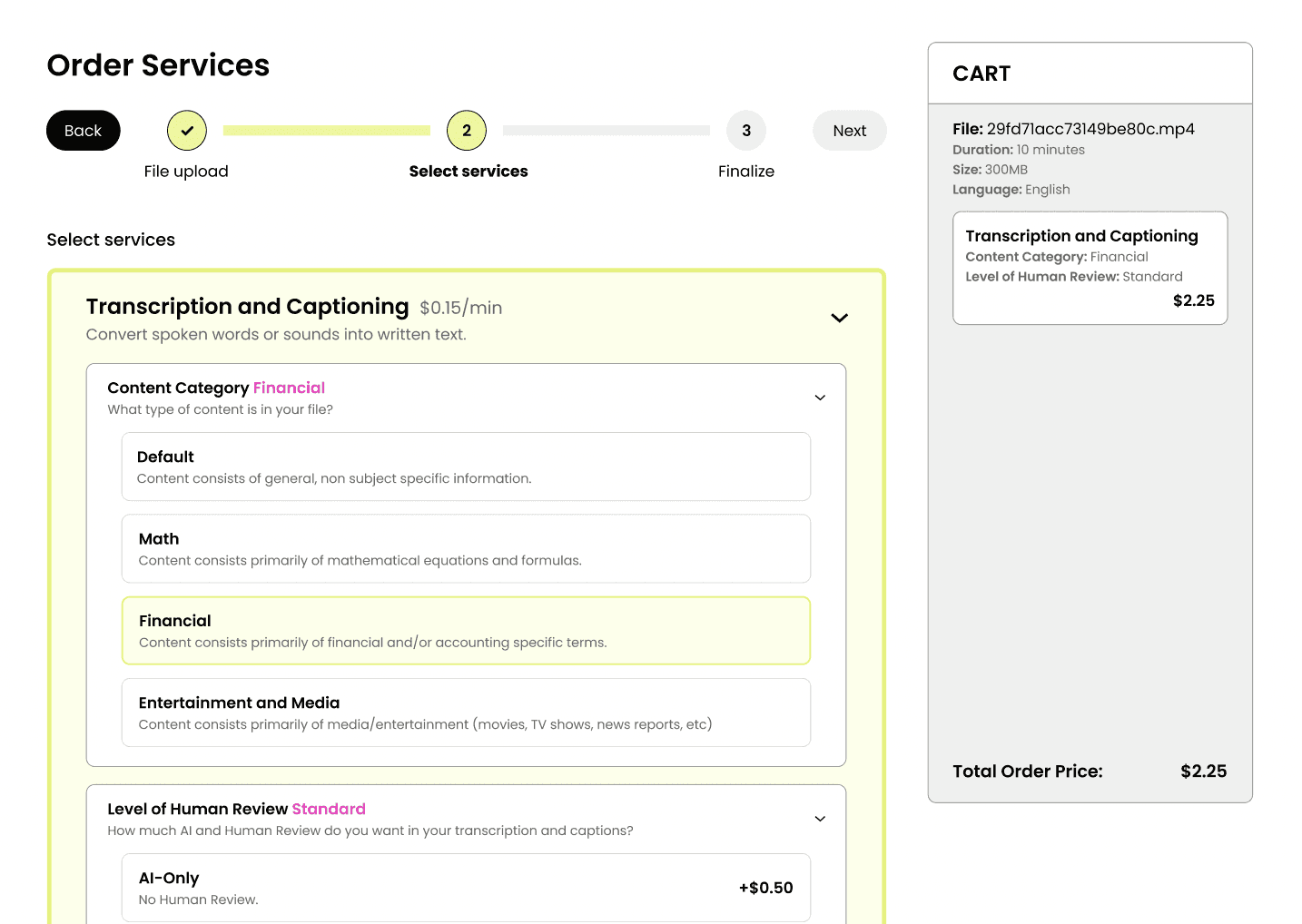
1 in 5, or 25% of enterprise orders were incorrectly configured and needed support tickets.
ITERATIONS
Implementation of Self-Reliant Progressive Disclosure with
Accordion Format in the Service Selection
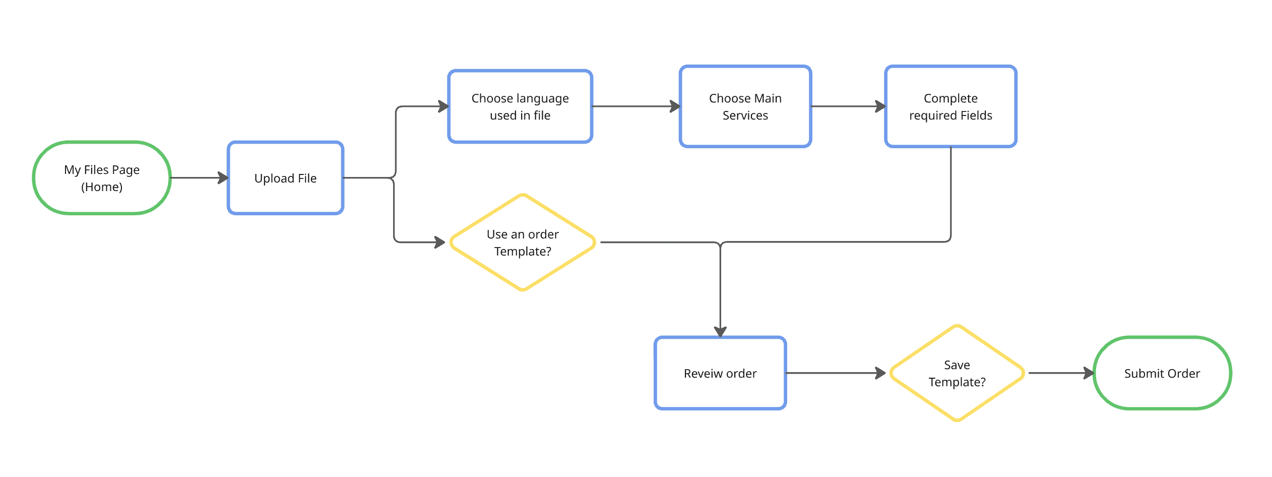
Original Form
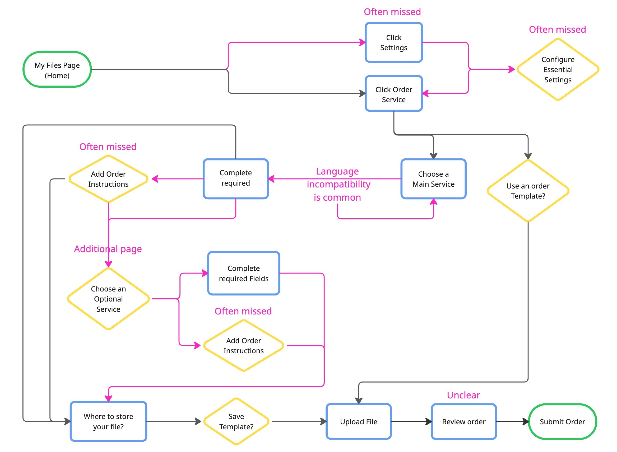
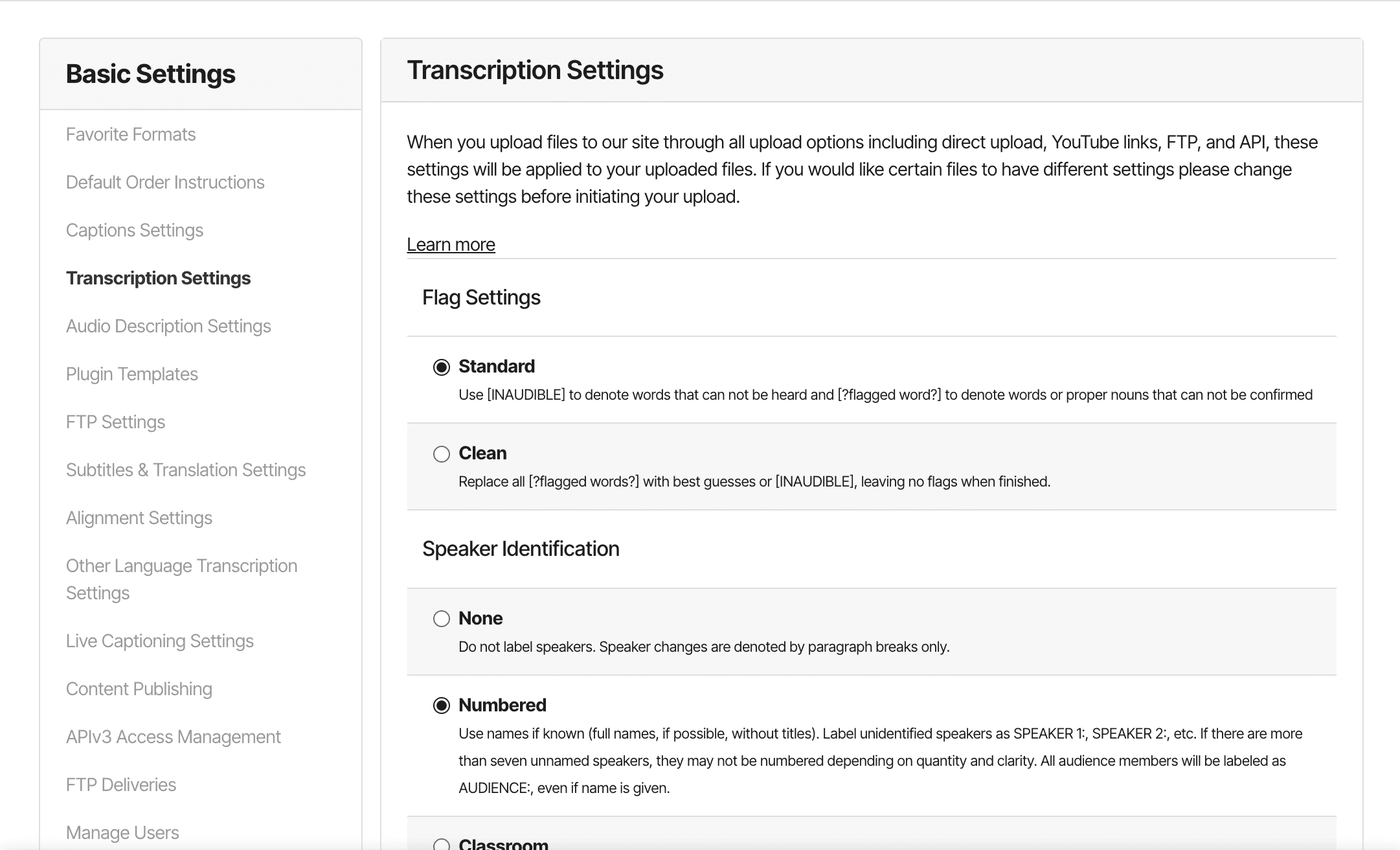
❌ The different sized boxes are overhwhelming and confusing
❌ Certain settings must be configured outside the order form before ordering
❌ The Order Instructions button is often missed
❌ The flow is scattered over two pages, therefore creating multiple order paths.

Initial Ideation (Cursor)
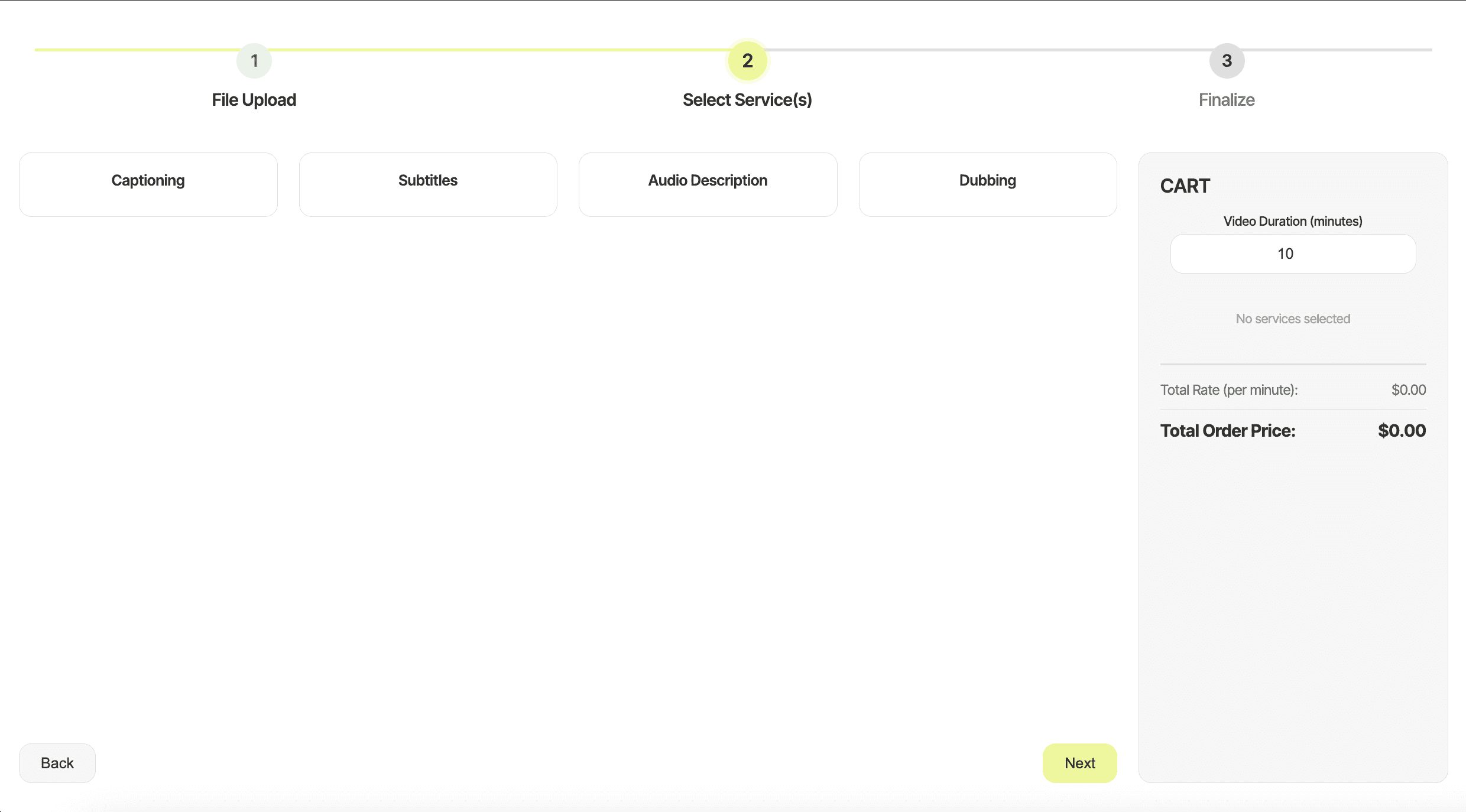
❌ "There are a lack of descriptions"
❌ "I don't like how condensed each service is. If I only choose one service, I am working with less than a fifth of the page"
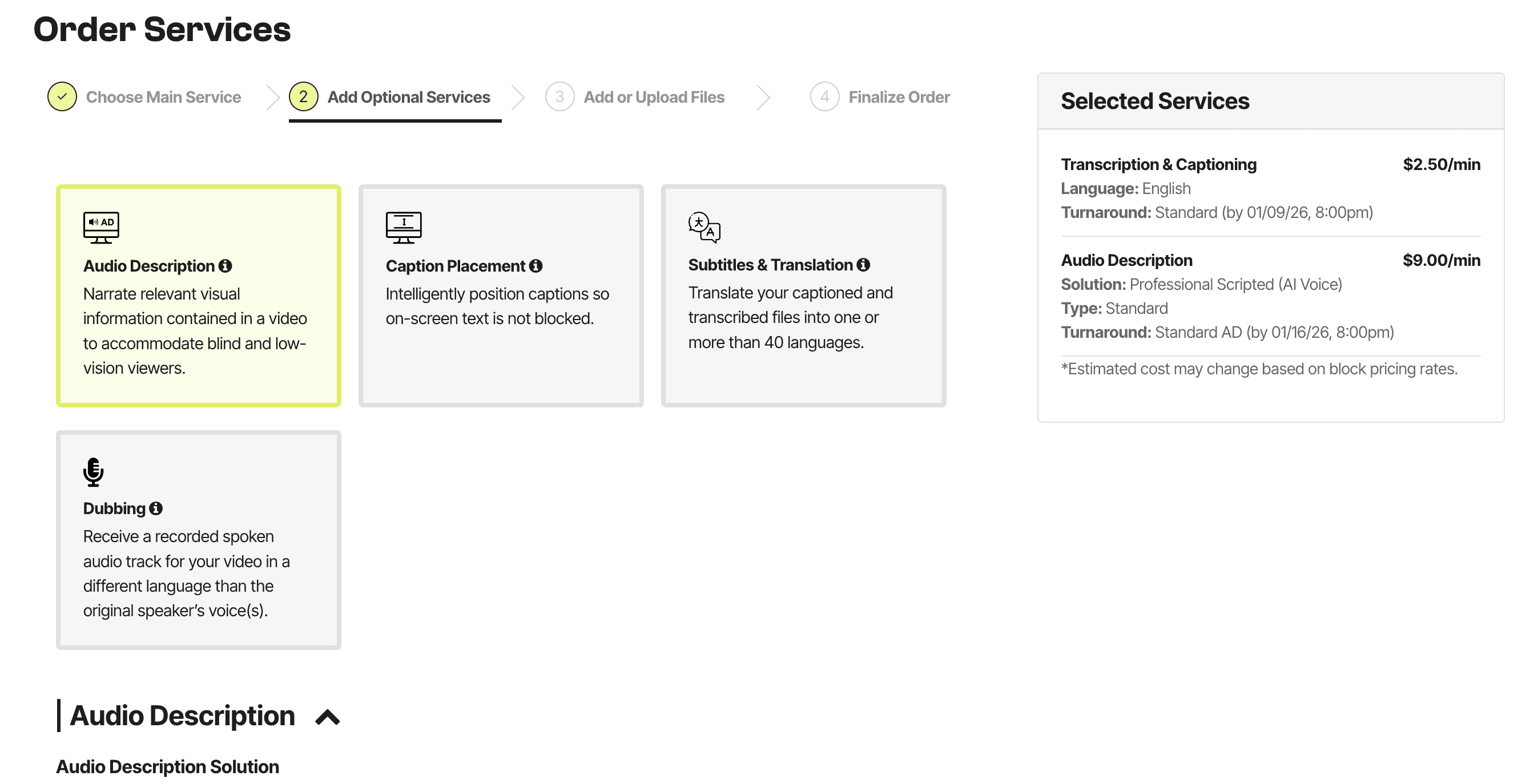
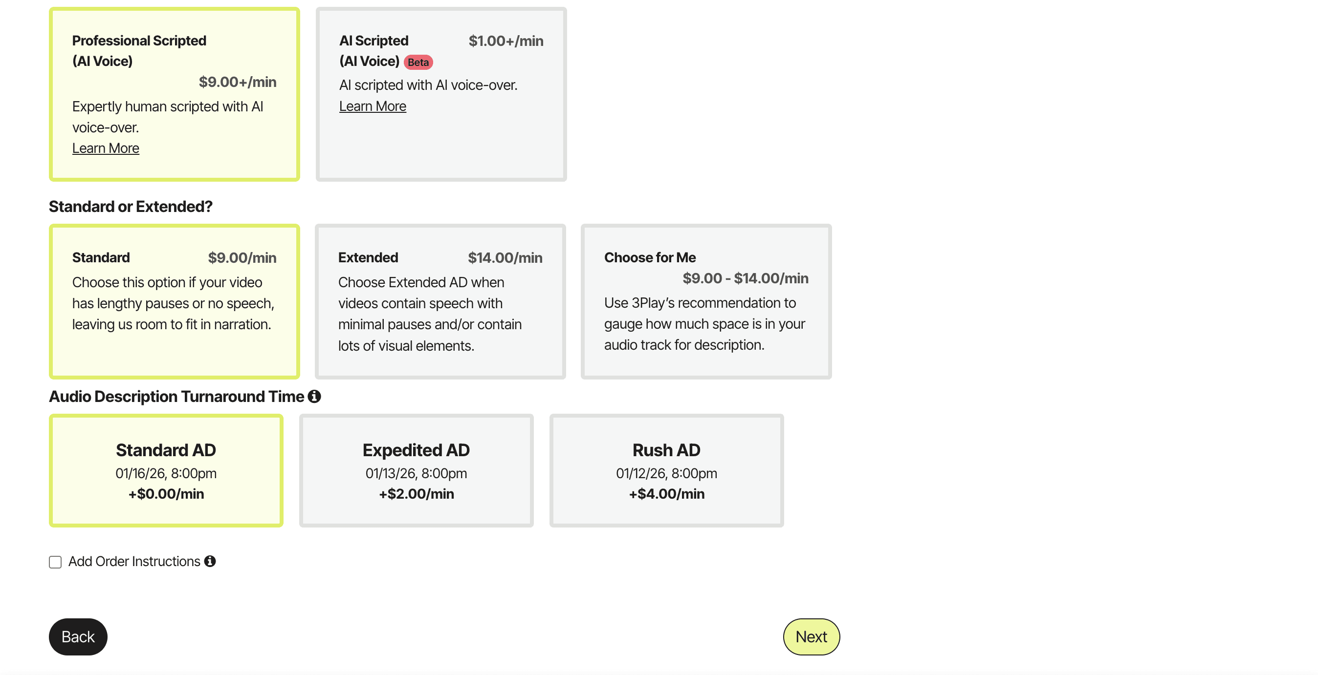
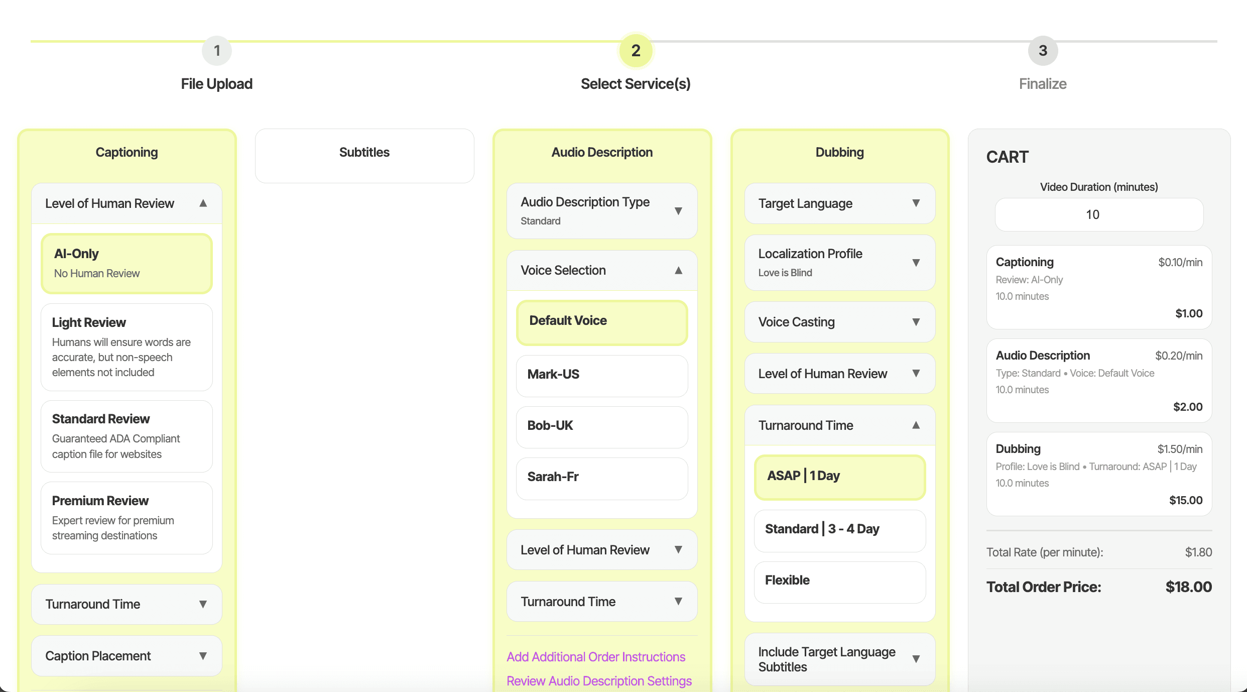
Final Service Selection Design with Accordions (Figma)
✅ Self-reliant progressive disclosure with accordions
✅ Single ordering path per service, embedding settings and instructions directly in the order flow
✅ Clear error messaging and required fields
Roadblock
⚠️ Overcoming an Obstacle
I wanted to validate our initial designs quickly, so I insisted vibe coding our low-fi wireframes with Cursor. We created a rough working prototype and tested it with our participants and gathered valuable feedback. The PM and the CS majors in my team were unfamiliar with Figma and wanted to continue working with Cursor for the high-fis prototypes, but there were a lot of debugging issues + inaccurate translations of our designs in the process. What was meant to speed up the process actually slowed us down under tight timeline
So, I strongly suggested we used Figma for hi-fis and gave a quick rundown of figma for the CS majors. As a result, we created an accurate + clean high-fi Figma prototype to handoff to dev.
I learned:
The value in speed for early prototyping
To leverage tools strategically, not blindly