

[Illumia - GET Mobile] Live Budget Tracking and Checkout
What began as a 2-week personal passion project was pitched directly to the RISD Dining Board, then the Product Lead of CBORD, which is now Illumia, to implement these designs live.
ROLE
UI/UX Designer and Researcher
TEAM
1 UX Designer, 1 Product Lead, 1 Application Support Specialist
TIMELINE
April 2024
2-week sprint
TOOLS
Figma, Miro
PROBLEM
Checking out a routine meal is an anxiety-inducing, daily inconvenience.
Through campus wellness research conducted for RISD's Health Education and Promotion Department, I discovered that dining logistics were a major barrier to student wellness. To address this issue at its root, I took the initiative to redesign GET Mobile, the primary app RISD students rely on to track their meal plans and campus finances.
SOLUTION
Quickly add funds to your student account during busy hours.
Pair real-time meal checkout while tracking your balance.
RESEARCH
I interviewed 20 students face-to-face to understand what's wrong.
I learned about the dining pain points of 20 students from three different housing areas on campus.
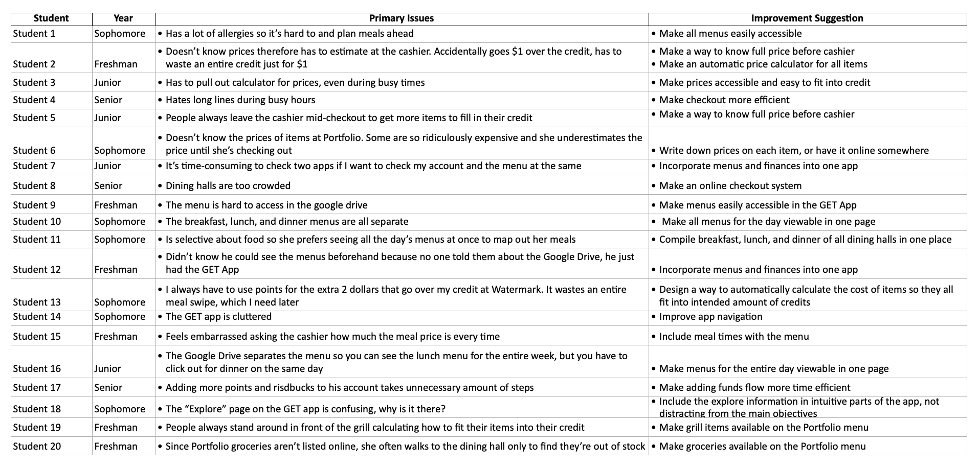
I aimed to fix three pain points that consistently appeared across all the interviews.
01
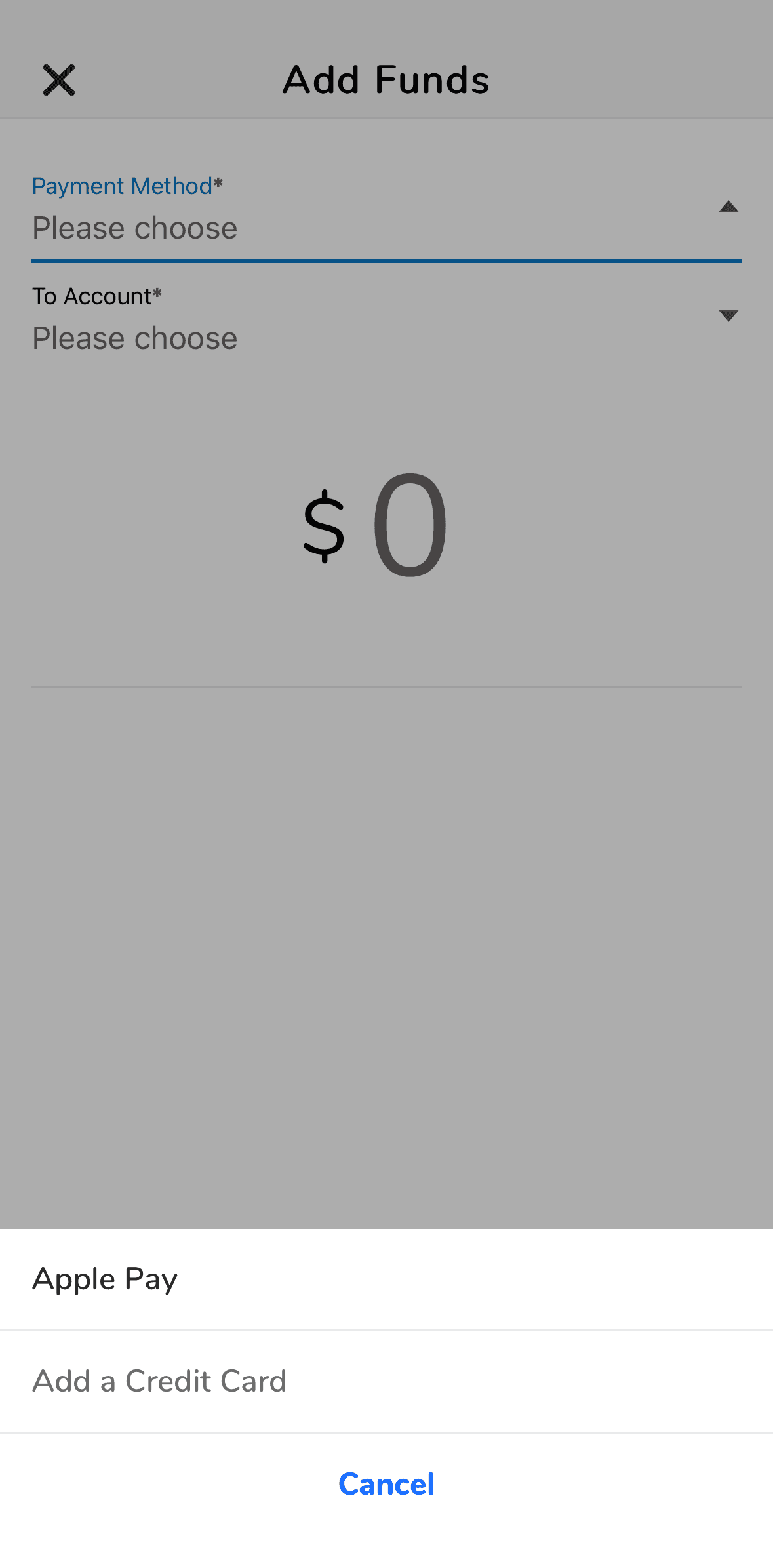
Adding funds was difficult to manage
Unnecessary steps stall busy hours. Input errors cause the form to restart.
02
03
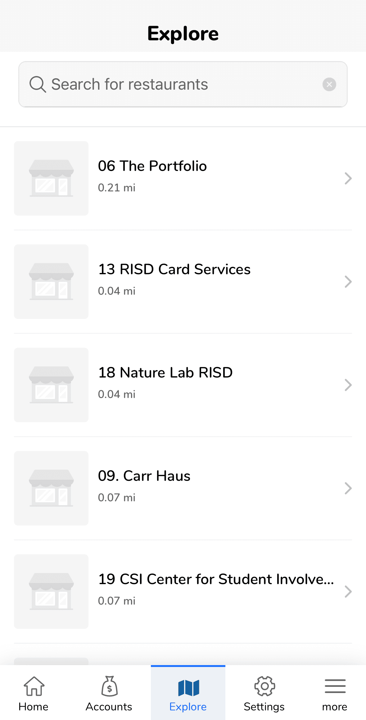
Mental Math anxiety during checkout
Must manually calculate total meal cost and budgeting before checkout.

DESIGN PROCESS
01 Add funds with no friction


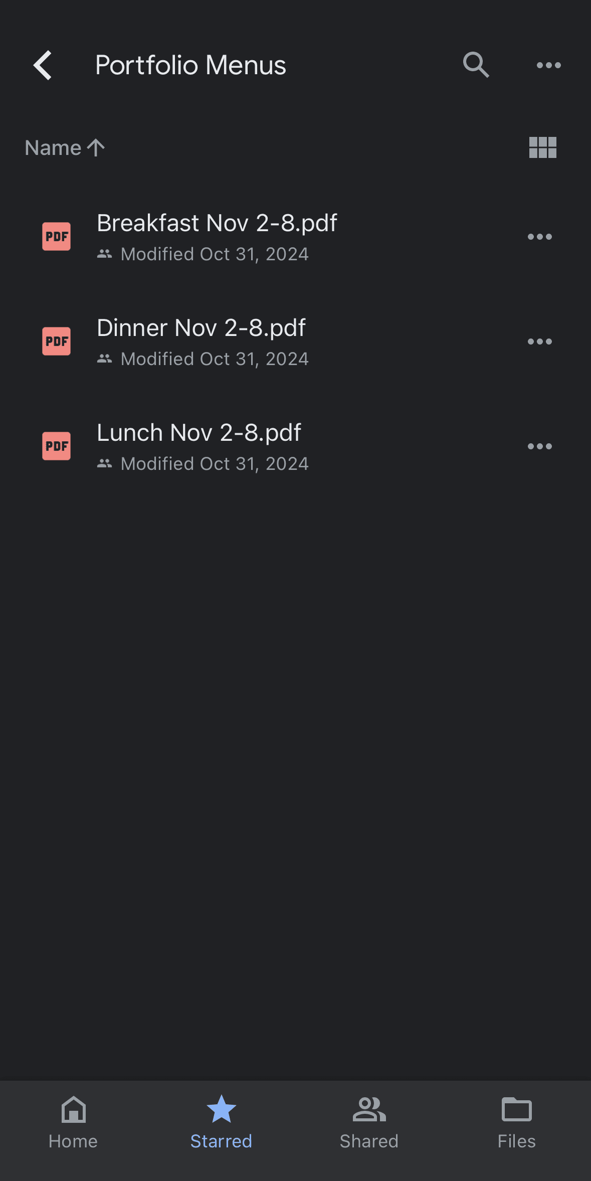
02 Access all essential data in one place


02 Checkout your meal seamlessly


Students still have to manually calculate how much of each payment method they must use
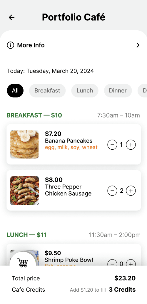

The checkout process automatically calculates necessary payments based on selections and visible balance
REFLECTION
What I learned + next steps
Sometimes, less is more
Many of the original app's UX problems stemmed from too many unnecessary or repetitive features. Just because there is a feature available somewhere doesn't mean it is accessible or even usable. Crucial steps should be seamlessly integrated into a flow.
Communicate with all Stakeholders
Designers, developers, and stakeholders all think differently. This was my first self-directed case study, and I learned so much about the world of stakeholders. Since I didn’t communicate with the backend team early on, misunderstandings arose during the process. For example, I found out much later that some other schools using this app don't have a credit system and just use dollars, which makes the dining checkout process much simpler. This brought up the conversation of the scope of this project, which solely focused on the experience of RISD students. To prevent future setbacks, I learned that I need to collaborate with both the business and developer sides from the very beginning. What began as a 2-week personal project was pitched directly to the RISD Dining Board, then the Product Lead of CBORD (Illumia) to implement these designs live.