
[3Play Media] Order Service Redesign
[3Play Media] Order Service Redesign
Role
Role
Lead UX Designer
Lead UX Designer
Team
Team
2 UX Leads, 1 Product Manager, 1 Product Marketer, 3 Consultants
2 UX Leads, 1 Product Manager, 1 Product Marketer, 3 Consultants
Timeline
Timeline
Aug 2025 -
Dec 2025
Aug 2025 -
Dec 2025
Tools/Skills
Tools/Skills
UX Research, UI Design, Figma, Cursor, Client Relations
UX Research, UI Design, Figma, Cursor, Client Relations
what did i do?
what did i do?
I led the redesign vision for a complex B2B SaaS Video Accessibility & Localization service order form to reduce support tickets and order errors.
The original service order form for 3Play Media was failing because users couldn’t make confident choices, therefore they couldn't predict the results. Each incorrect order created support tickets, manual intervention, and delayed media publishing. I led the redesign of a B2B SaaS ordering system used by 10,000+ clients, focusing on reducing decision uncertainty.
My redesign dropped these errors from 25% → 5%, reducing Operational Risk by 80%
In the final testing, users can complete compliance-sensitive orders independently rather than relying on support tickets (manual intervention).
USER INTERVIEWS
USER INTERVIEWS
I interviewed 4 internal employees that assist customers with the order form.
I interviewed 4 internal employees that assist customers with the order form.
The participants are Customer Success Managers, a Senior Technical Support Specialist, and a Senior BDR Manager, who work with various customers daily. I observed their natural workflow and identified friction points in real-time.
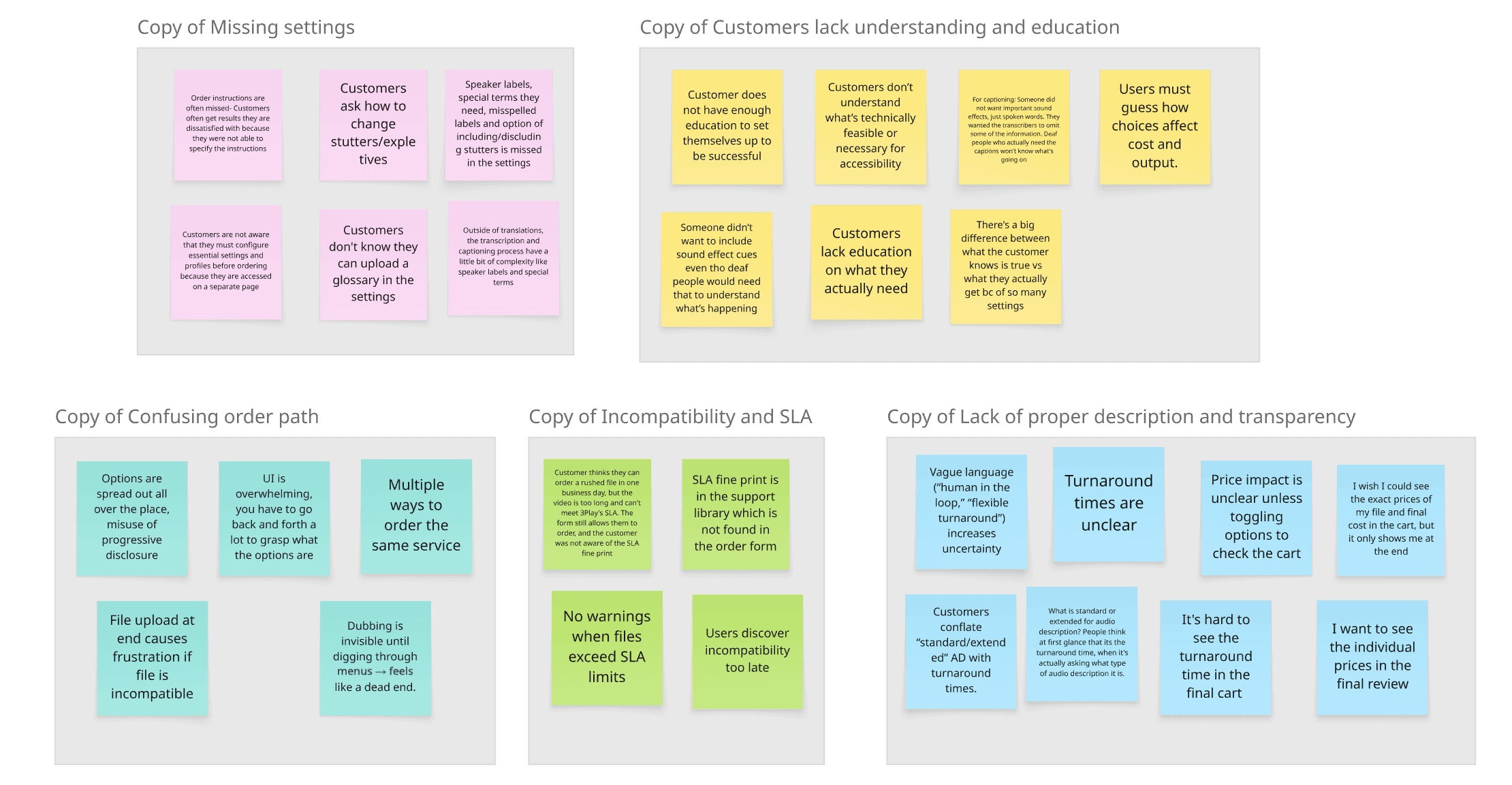
Identifying the problems
Identifying the problems
I narrowed down the complaints to 3 main pain points in the order form:
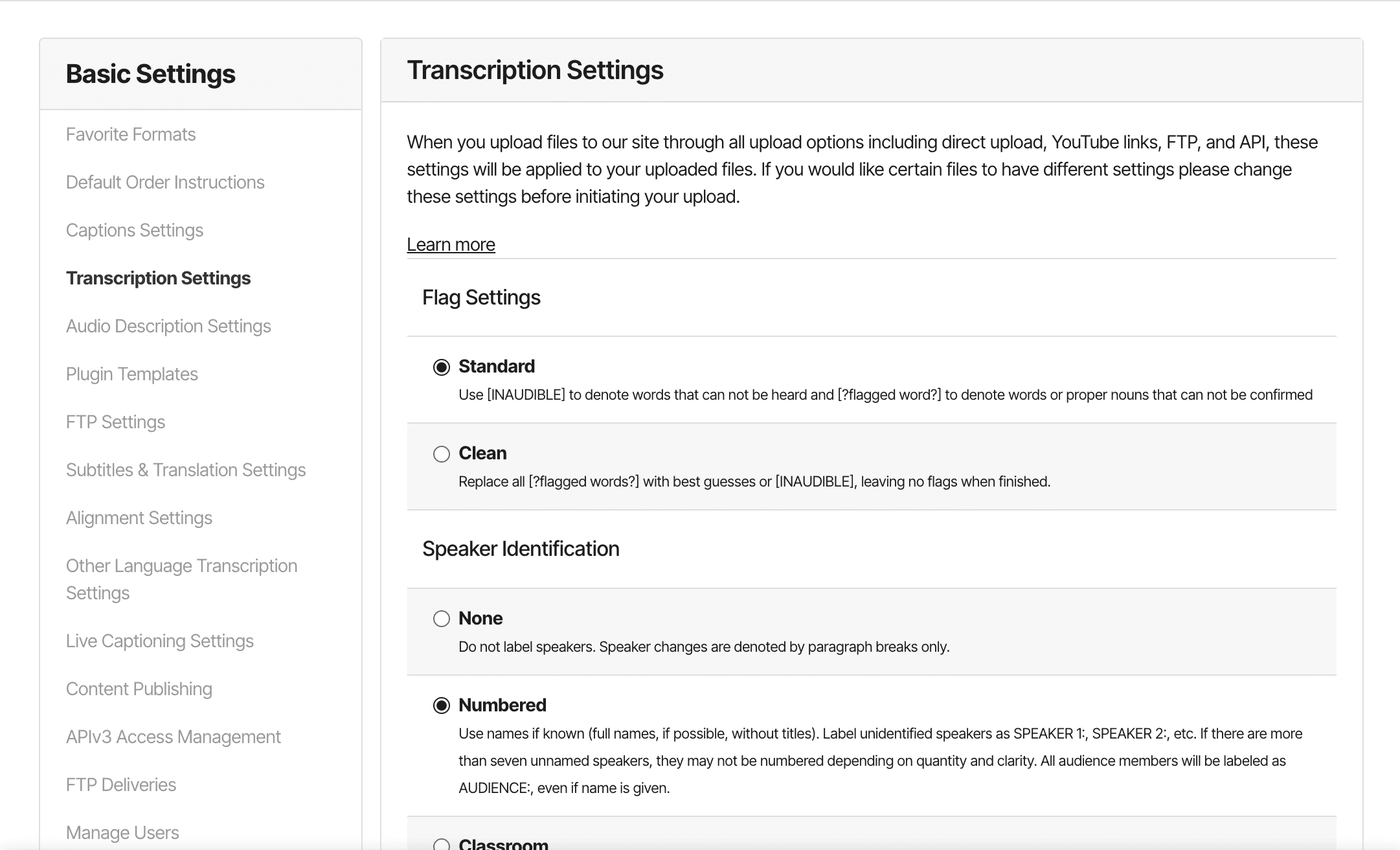
Missed Critical Decisions
Missed Critical Decisions
"There are so many hidden options in this form that are crucial for a truly customizable order. Customers don't know about these details."
"There are so many hidden options in this form that are crucial for a truly customizable order. Customers don't know about these details."
Disorganized Order Path
Disorganized Order Path
"You have to keep going back and forth pages and buttons to see what all the options are."
Unclear Descriptions, Status, and Results
Unclear Descriptions, Status, and Results
“I don’t even know if anything I’m doing is correct, so I'm worried the result is not going to be what I want.”
“I don’t even know if anything I’m doing is correct, so I'm worried the result is not going to be what I want.”
[3Play Media] Order Service Redesign
Role
Lead UX Designer
Team
2 UX Leads, 1 Product Manager, 1 Product Marketer, 2 Consultants
Timeline
Aug 2025 - Dec 2025
Tools/Skills
UX Research, UI Design, Figma, Cursor, Client Relations
The solution
My redesign dropped these errors from 25% → 5%, reducing Operational Risk by 80%
Users can complete compliance-sensitive orders independently rather than relying on support tickets (manual intervention).
[3Play Media] Order Service Redesign
Role
Lead UX Designer
Team
2 UX Leads, 1 Product Manager, 1 Product Marketer, 2 Consultants
Timeline
Aug 2025 - Dec 2025
Tools/Skills
UX Research, UI Design, Figma, Cursor, Client Relations
Identifying the problems
I narrowed down the responses to 3 main pain points in the order form:
Missed Critical Decisions
"There are so many hidden options in this form that are crucial for a truly customizable order. Customers don't know about these details."
Disorganized Order Path
"You have to keep going back and forth pages and buttons to see what all the options are."
Unclear Descriptions, Status, and Results
“I don’t even know if anything I’m doing is correct, so I'm worried the result is not going to be what I want.”
The solution
My redesign dropped these errors from 25% → 5%, reducing Operational Risk by 80%
Users can complete compliance-sensitive orders independently rather than relying on support tickets (manual intervention).
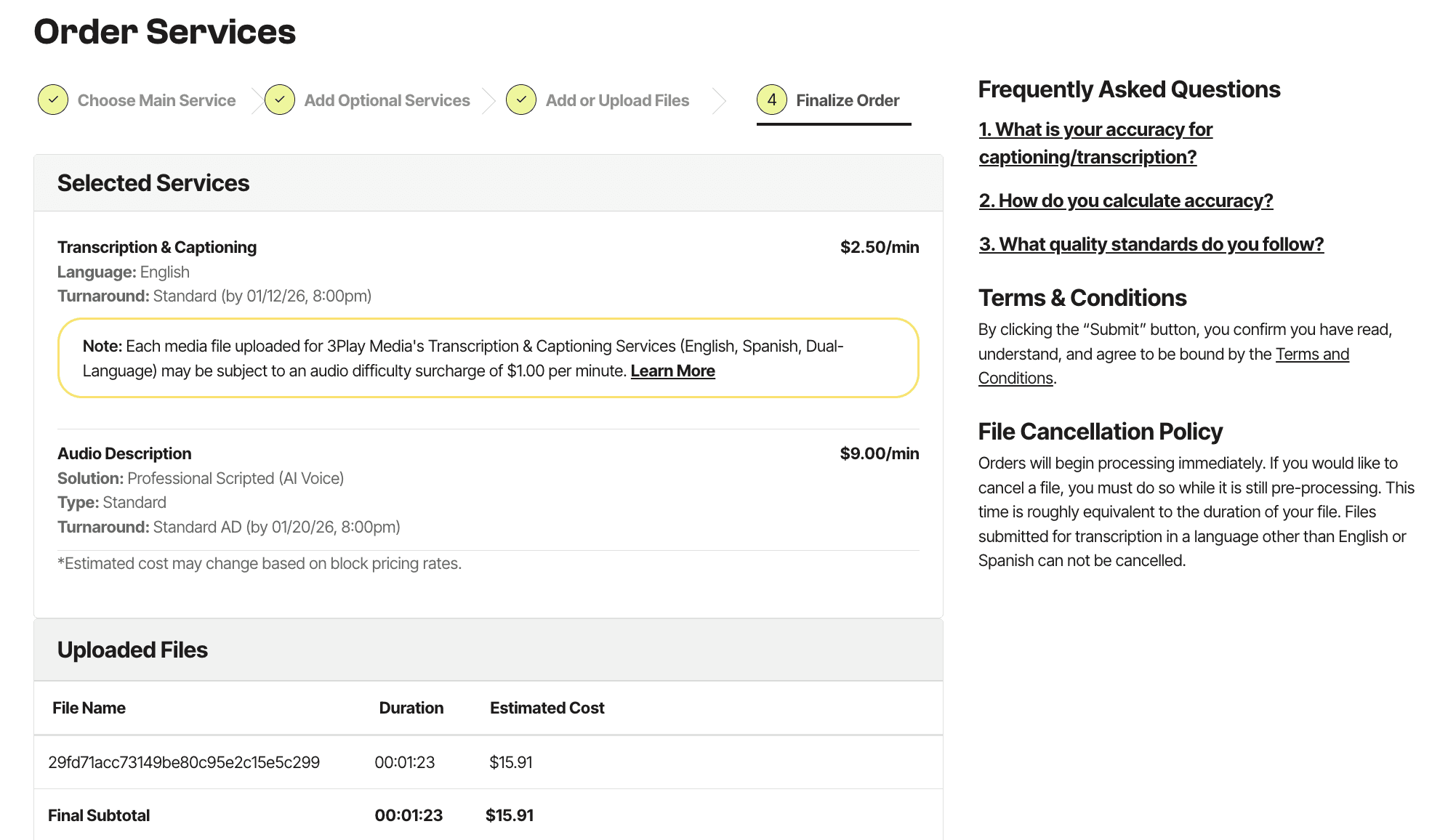
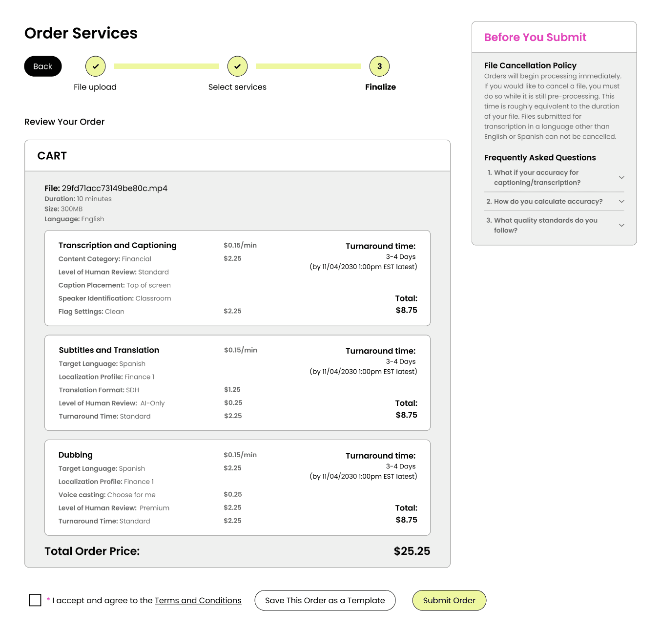
Final Review Page
Original
Original
Improved
Improved
❌ Terms and conditions can be missed
❌ Turnaround times are buried in text.
✅ Terms and Conditions is an active checkbox step.
✅ Turnaround time is emphasized
DISAGREEMENT WITH MY MENTOR/Stakeholder
Varying Viewpoints become an Opportunity!
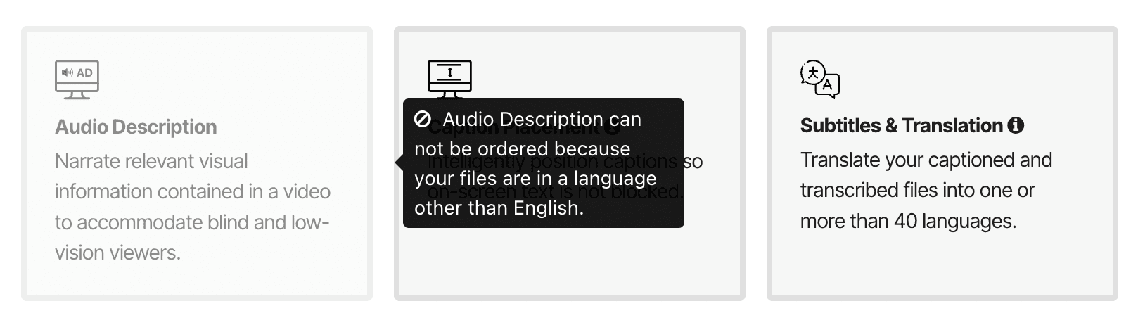
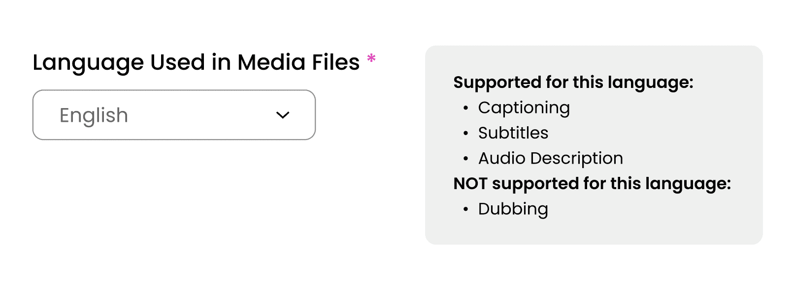
I had differing perspectives from the Product Marketer about the use of disabled controls, or greyed out options, to indicate features unavailable for the selected language. He believed these disabled controls increased awareness of additional offerings and potential upsell opportunities, but I believed they created confusion by presenting users with options they couldn’t act on. While I was thinking for the user, he was thinking for the business. I initiated a solution bridging both needs by designing a contextual limitation message that appeared only after selecting a language to communicate availablity without clutter.
Final Review Page
Reflection
Balancing Business and User Needs
I had differing perspectives from the Product Marketer about the use of disabled controls, or greyed out options, to indicate features unavailable for the selected language. He believed these disabled controls increased awareness of additional offerings and potential upsell opportunities, but I believed they created confusion by presenting users with options they couldn’t act on. While I was thinking for the user, he was thinking for the business. I initiated a solution bridging both needs by designing a limitation message that appeared only after selecting a language to inform the users, but not overwhelm them.
Leadership Skills
As the Lead Designer for this project, I learned the importance of considering all proposals while also making firm decisions that I believe are in the design's best interest. My team of 5 consisted of students from both engineering and design backgrounds, and our stakeholders were 3Play's Product Manager and Product Marketer, both whom don't specialize in design. As the leader, I challenged design decisions and unblocked design problems while also advocating for my team.
what did i do?
I led the redesign vision for a complex B2B SaaS Video Accessibility & Localization service order form to reduce support tickets and order errors.
The original service order form for 3Play Media was failing because users couldn’t make confident choices, therefore they couldn't predict the results. Each incorrect order created support tickets, manual intervention, and delayed media publishing. I led the redesign of a B2B SaaS ordering system used by 10,000+ clients, focusing on reducing decision uncertainty.
Identifying the problems
I narrowed down the responses to 3 main pain points in the order form:
Missed Critical Decisions
"There are so many hidden options in this form that are crucial for a truly customizable order. Customers don't know about these details."
Disorganized Order Path
"You have to keep going back and forth pages and buttons to see what all the options are."
Unclear Descriptions, Status, and Results
“I don’t even know if anything I’m doing is correct, so I'm worried the result is not going to be what I want.”
Made with 🩷, ☕️
overcoming an obstacle
⚠️ Facing a Roadblock
I wanted to validate our initial designs quickly, so I insisted vibe coding our low-fi wireframes with Cursor. We vibe coded a rough working prototype and tested it with our participants and gathered valuable feedback. The PM and the CS majors in my team were unfamiliar with Figma and wanted to continue working with Cursor for the high-fis prototypes, but there were a lot of debugging issues + inaccurate translations of our designs in the process. What was meant to speed up the process actually slowed us down under tight timeline
So, I strongly suggested we used Figma for hi-fis and gave a quick rundown of figma for the CS majors. As a result, we created an accurate + clean high-fi Figma prototype to handoff to dev.
I learned:
The value in speed for early prototyping
To leverage tools strategically, not blindly
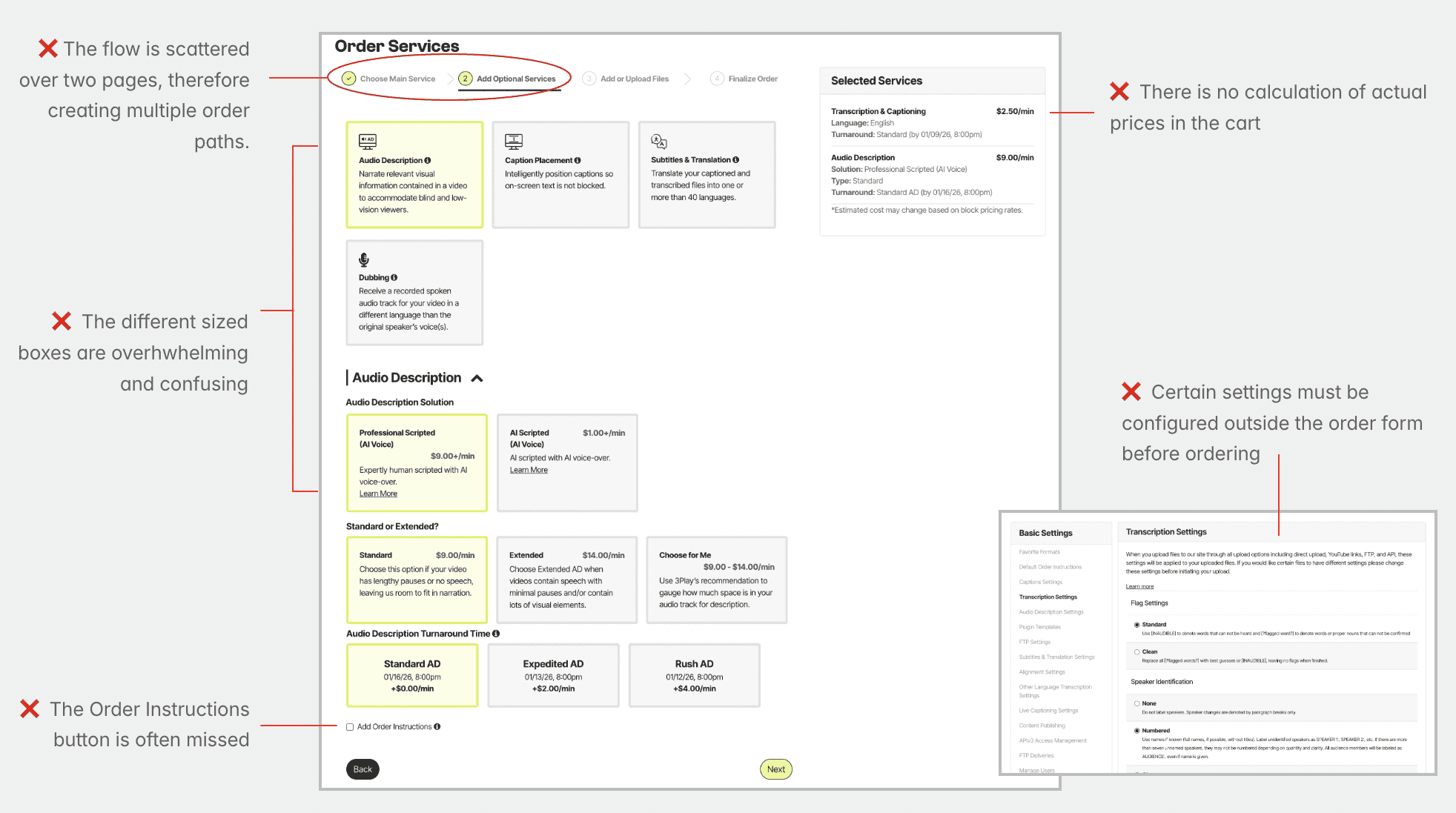
ITERATIONS
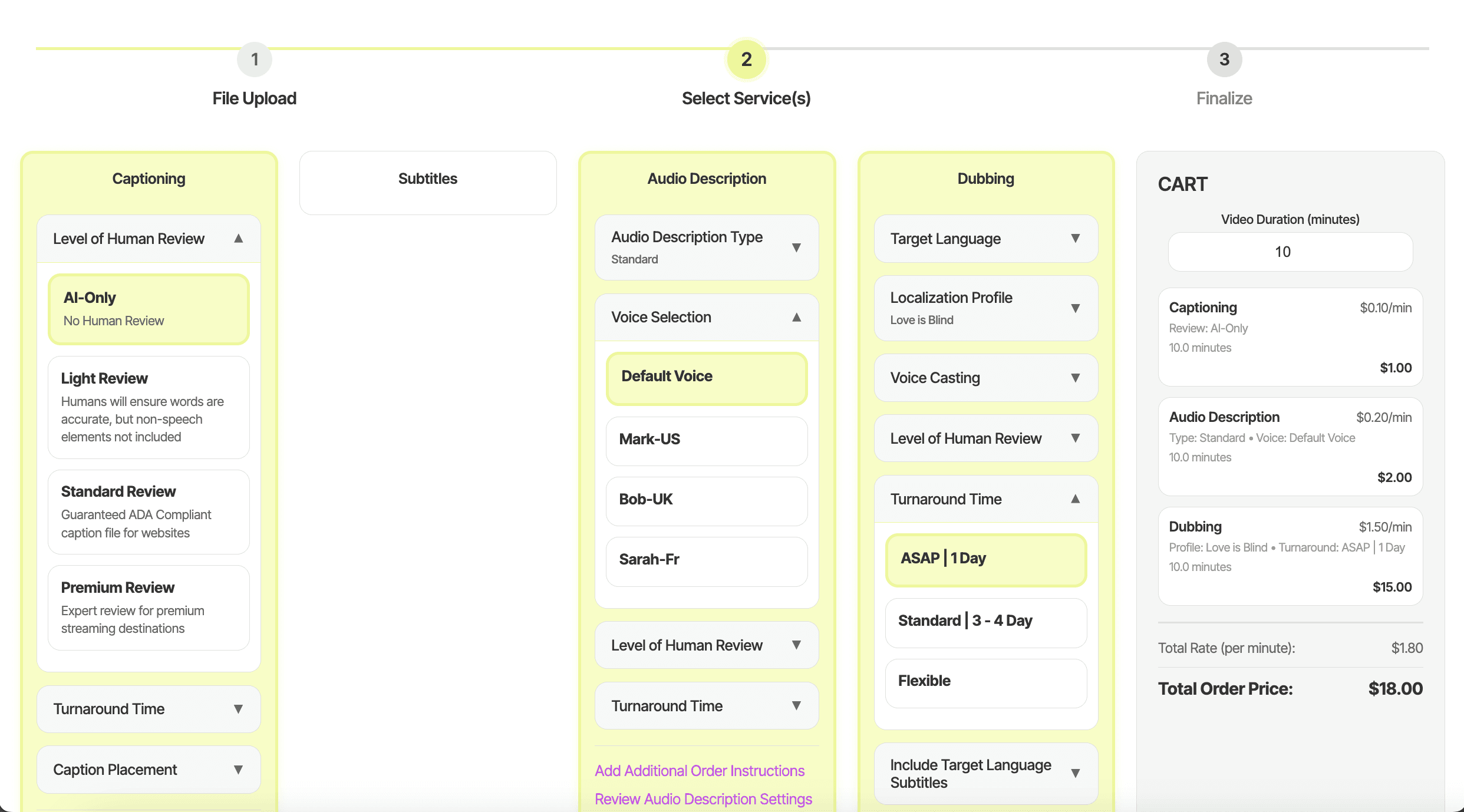
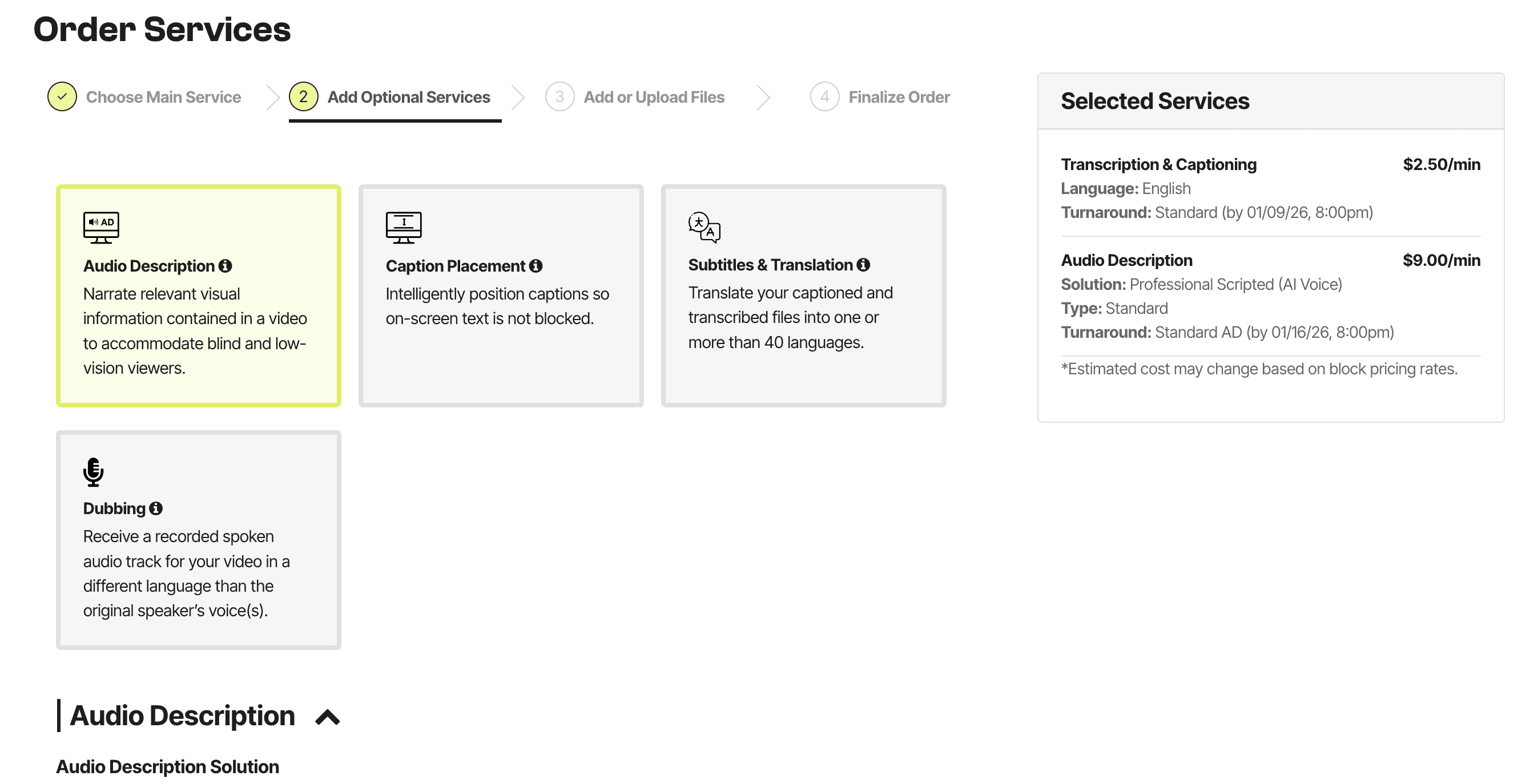
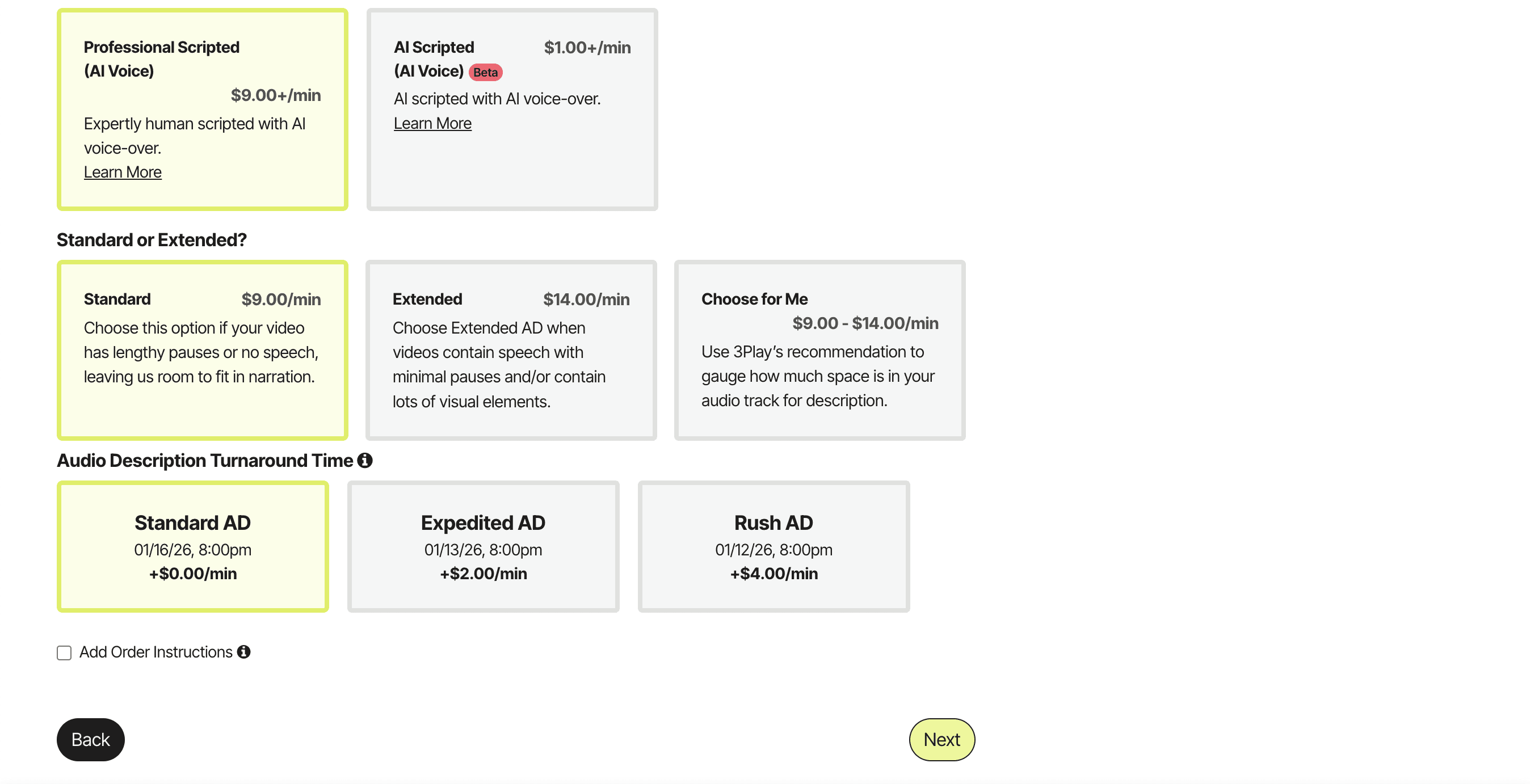
Implementation of the Accordion Format in the Service Selection
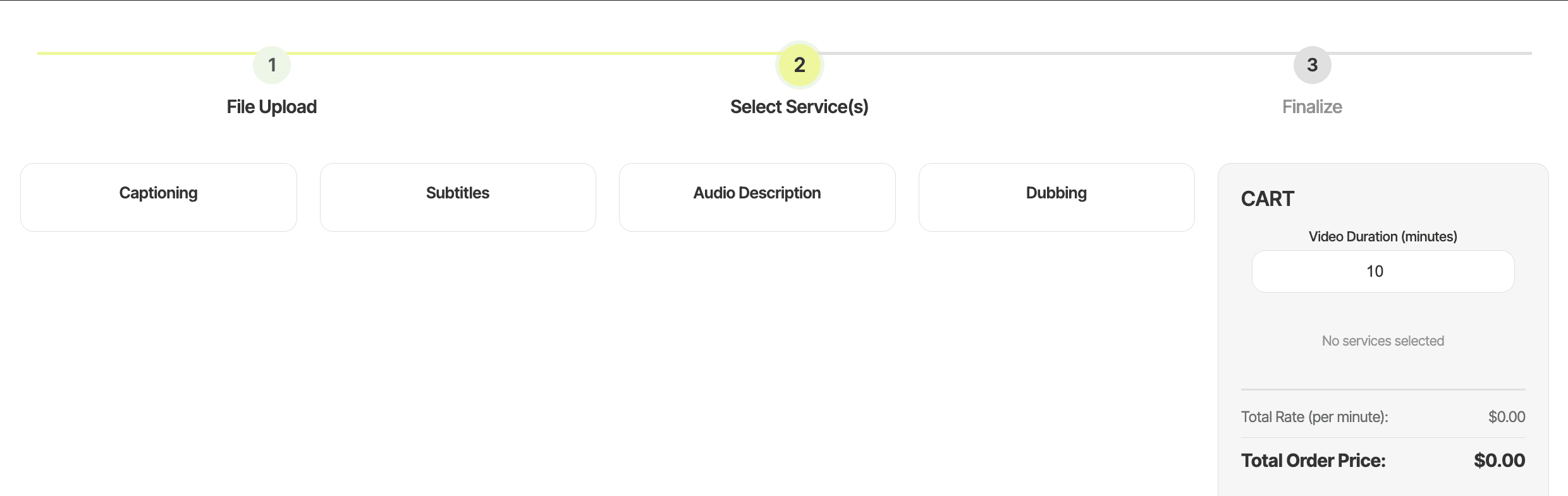
Original Form

Initial Ideation (Cursor)
❌ "There are a lack of descriptions"
❌ "I don't like how condensed each service is. If I only choose one service, I am working with less than a fifth of the page"
✅ Self-reliant progressive disclosure with accordions
Final Service Selection Design with Accordions (Figma)
✅ Self-reliant progressive disclosure with accordions
✅ Single ordering path per service, embedding settings and instructions directly in the order flow
✅ Clear error messaging and required fields
Final Review Page
Original
Improved
❌ Terms and conditions can be missed
❌ Turnaround times are buried in text.
✅ Terms and Conditions is an active checkbox step.
✅ Turnaround time is emphasized
Reflection
Leadership Skills
As the Lead Designer for this project, I learned the importance of considering all proposals while also making firm decisions that I believe are in the design's best interest. My team of 5 consisted of students from both engineering and design backgrounds, and our stakeholders were 3Play's Product Manager and Product Marketer, both whom don't specialize in design. As the leader, I challenged design decisions and unblocked design problems while also advocating for my team.
Balancing Business and User Needs
I had differing perspectives from the Product Marketer about the use of disabled controls, or greyed out options, to indicate features unavailable for the selected language. He believed these disabled controls increased awareness of additional offerings and potential upsell opportunities, but I believed they created confusion by presenting users with options they couldn’t act on. While I was thinking for the user, he was thinking for the business. I initiated a solution bridging both needs by designing a limitation message that appeared only after selecting a language to inform the users, but not overwhelm them.
USER INTERVIEWS
I interviewed 4 internal employees that assist customers with the order form.
The goal is to identify the friction points in the current ordering process to inform a redesign that will allow customers to self-serve and rely less on company support. The participants are Customer Success Managers, a Senior Technical Support Specialist, a Senior BDR Manager, who work with various external customers on a daily basis. I observed their natural workflow and identified friction points in real-time.
Balancing Business and User Needs
Leadership Skills
Leadership Skills
As the Lead Designer for this project, I learned the importance of considering all proposals while also making firm decisions that are in the design's best interest. My team of 5 consisted of students from both engineering and design backgrounds, and our stakeholders were 3Play's Product Manager and Product Marketer, both whom don't specialize in design. I challenged design decisions while also advocating for everyone's perspective.
Skills I Gained from this Experience
Skills I Gained from this Experience
Before this project, I was solely user needs-driven. I advocated strongly for the most seamless experience for users, but I failed to consider business needs. My disagreement with my mentor in this project taught me the value and strategy of solving for both business and user needs.
Skills I Gained from this Experience
Made with 🩷, ☕️
Original
Improved
❌ Terms and conditions can be missed
❌ Turnaround times are buried in text.
✅ Terms and Conditions is an active checkbox step.
✅ Turnaround time is emphasized
25% of enterprise orders were incorrectly completed and had to be redone.
25% of enterprise orders were incorrectly completed and had to be redone.
25% of enterprise orders were incorrectly completed and had to be redone.
ITERATIONS
ITERATIONS
Implementation of Self-Reliant Progressive Disclosure with
Accordion Format in the Service Selection
Original Form
❌ The different sized boxes are overhwhelming and confusing
❌ The different sized boxes are overhwhelming and confusing
❌ Certain settings must be configured outside the order form before ordering
❌ Certain settings must be configured outside the order form before ordering
❌ The Order Instructions button is often missed
❌ The Order Instructions button is often missed
❌ The flow is scattered over two pages, therefore creating multiple order paths.
❌ The flow is scattered over two pages, therefore creating multiple order paths.
Initial Ideation (Cursor)
❌ "There are a lack of descriptions"
❌ "I don't like how condensed each service is. If I only choose one service, I am working with less than a fifth of the page"
✅ Self-reliant progressive disclosure with accordions
Final Service Selection Design with Accordions (Figma)
✅ Self-reliant progressive disclosure with accordions
✅ Single ordering path per service, embedding settings and instructions directly in the order flow
✅ Clear error messaging and required fields
Roadblock
⚠️ Overcoming an Obstacle
I wanted to validate our initial designs quickly, so I insisted vibe coding our low-fi wireframes with Cursor. We vibe coded a rough working prototype and tested it with our participants and gathered valuable feedback. The PM and the CS majors in my team were unfamiliar with Figma and wanted to continue working with Cursor for the high-fis prototypes, but there were a lot of debugging issues + inaccurate translations of our designs in the process. What was meant to speed up the process actually slowed us down under tight timeline.
So, I strongly suggested we used Figma for hi-fis and gave a quick rundown of figma for the CS majors. As a result, we created an accurate + clean high-fi Figma prototype to handoff to dev.
I learned:
The value in speed for early prototyping
To leverage tools strategically, not blindly
In the final testing, users can complete compliance-sensitive orders independently rather than relying on support tickets (manual intervention).
My redesign dropped these errors from 25% → 5%, reducing Operational Risk by 80%
ITERATIONS
Implementation of Self-Reliant Progressive Disclosure with
Accordion Format in the Service Selection
Original Form
❌ The different sized boxes are overhwhelming and confusing
❌ Certain settings must be configured outside the order form before ordering
❌ The Order Instructions button is often missed
❌ The flow is scattered over two pages, therefore creating multiple order paths.
Initial Ideation (Cursor)
❌ "There are a lack of descriptions"
❌ "I don't like how condensed each service is. If I only choose one service, I am working with less than a fifth of the page"
✅ Self-reliant progressive disclosure with accordions
Final Service Selection Design with Accordions (Figma)
✅ Self-reliant progressive disclosure with accordions
✅ Single ordering path per service, embedding settings and instructions directly in the order flow
✅ Clear error messaging and required fields
❌ Users discover errors and limitations too late due to a lack of warning messages
❌ Appears on the services page (page 2)
Original
Improved
✅ Displays error and limitation messages before continuing
✅ Appears on the upload page (page 1)
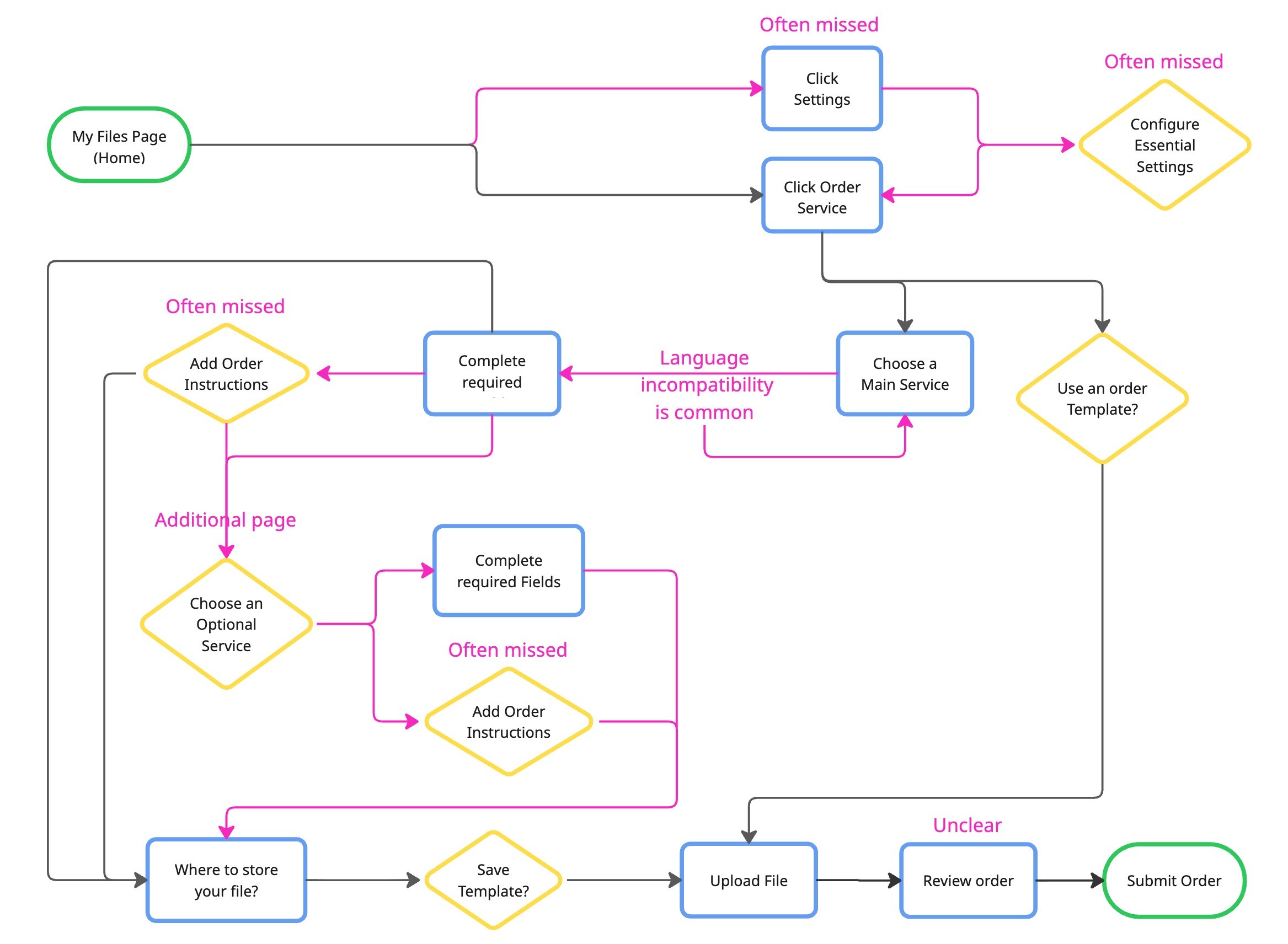
path reconfiguration
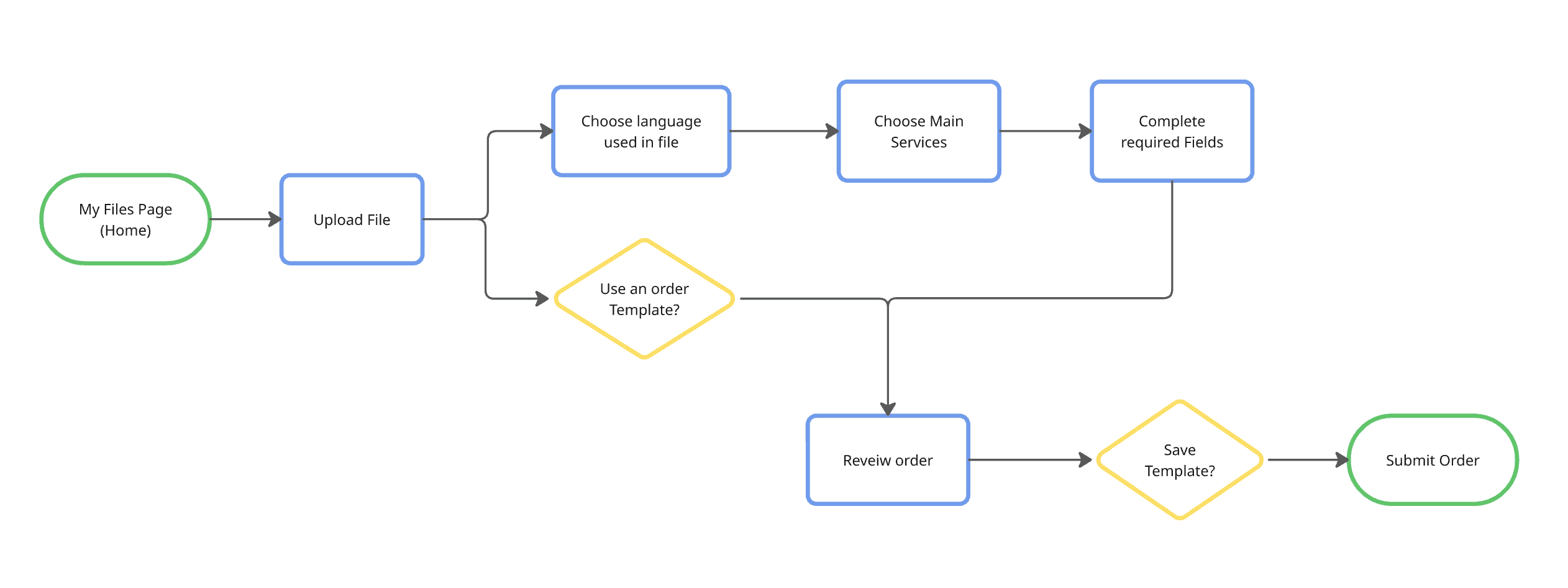
Comparing the User Flows visually demonstrate the reduced cognitive overload and more straightforward path.
I tested my final designs with 10 real customers of 3Play Media. Participants claimed that there is a
noticeable decrease in switching between pages and needing support.
Original Form Average Task Time:
9 minutes
Original Form
Original Form
Redesigned form Average Task Time:
6 minutes
Redesigned Form
Redesigned Form
80% Decrease in errors and support tickets.
path reconfiguration
Comparing the User Flows visually demonstrate the reduced cognitive overload and more straightforward path.
I tested my final designs with 10 real customers of 3Play Media. Participants claimed that there is a
noticeable decrease in switching between pages and needing support.
Original Form Average Task Time:
9 minutes
Original Form
Redesigned form Average Task Time:
6 minutes
Redesigned Form
80% Decrease in errors and support tickets.
Final validation
Comparing the User Flows visually demonstrate the reduced cognitive overload and more straightforward path.
I tested my final designs with 10 real customers of 3Play Media. Participants claimed that there is a noticable decrease in switching between pages and needing support.
Original Form Average Task Time:
9 minutes
Redesigned form Average Task Time:
6 minutes
80% Decrease in errors and support tickets.
USER INTERVIEWS
I interviewed 4 internal employees that assist customers with the order form.
The goal is to identify the friction points in the current ordering process to inform a redesign that will allow customers to self-serve and rely less on company support. The participants are Customer Success Managers, a Senior Technical Support Specialist, a Senior BDR Manager, who work with various external customers on a daily basis. I observed their natural workflow and identified friction points in real-time.
User group
This form serves both individuals + enterprise teams. 10,000+ customers globally across education, media & entertainment, enterprise, and government sectors.
This form serves both individuals + enterprise teams. 10,000+ customers globally across education, media & entertainment, enterprise, and government sectors.
DISAGREEMENT WITH MY MENTOR/Stakeholder
Raising a problem that the Stakeholder missed
I had differing perspectives from the Product Marketer about the use of disabled controls, or greyed out options, to indicate features unavailable for the selected language. He believed these disabled controls increased awareness of additional offerings and potential upsell opportunities, but I believed they created confusion by presenting users with options they couldn’t act on. While I was thinking for the user, he was thinking for the business. I initiated a solution bridging both needs by designing a contextual limitation message that appeared only after selecting a language to communicate availablity without clutter.
❌ Users discover errors and limitations too late due to a lack of warning messages
❌ Appears on the services page (page 2)
Original
Improved
✅ Displays error and limitation messages before continuing
✅ Appears on the upload page (page 1)
DISAGREEMENT WITH MY MENTOR/Stakeholder
Raising a problem that the Stakeholder missed
I had differing perspectives from the Product Marketer about the use of disabled controls, or greyed out options, to indicate features unavailable for the selected language. He believed these disabled controls increased awareness of additional offerings and potential upsell opportunities, but I believed they created confusion by presenting users with options they couldn’t act on. While I was thinking for the user, he was thinking for the business. I initiated a solution bridging both needs by designing a contextual limitation message that appeared only after selecting a language to communicate availablity without clutter.
❌ Users discover errors and limitations too late due to a lack of warning messages
Original
Improved
✅ Displays error and limitation messages before continuing
✅ Appears on the upload page (page 1)
overcoming an obstacle
⚠️ Facing a Roadblock
I wanted to validate our initial designs quickly, so I insisted vibe coding our low-fi wireframes with Cursor. We vibe coded a rough working prototype and tested it with our participants and gathered valuable feedback. The PM and the CS majors in my team were unfamiliar with Figma and wanted to continue working with Cursor for the high-fis prototypes, but there were a lot of debugging issues + inaccurate translations of our designs in the process. What was meant to speed up the process actually slowed us down under tight timeline
So, I strongly suggested we used Figma for hi-fis and gave a quick rundown of figma for the CS majors. As a result, we created an accurate + clean high-fi Figma prototype to handoff to dev.
I learned:
The value in speed for early prototyping
To leverage tools strategically, not blindly
ITERATIONS
Implementation of the Accordion Format in the Service Selection
Original Form
Initial Ideation (Cursor)
❌ "There are a lack of descriptions"
❌ "I don't like how condensed each service is. If I only choose one service, I am working with less than a fifth of the page"
✅ Self-reliant progressive disclosure with accordions
Final Service Selection Design with Accordions (Figma)
✅ Self-reliant progressive disclosure with accordions
✅ Single ordering path per service, embedding settings and instructions directly in the order flow
✅ Clear error messaging and required fields
Final validation
Comparing the User Flows visually demonstrate the reduced cognitive overload.
I tested my final designs with 10 real customers of 3Play Media. Participants claimed that there is a noticable decrease in switching between pages and needing support.
Original Form Average Task Time:
9 minutes
Redesigned form Average Task Time:
6 minutes